Physical Address
304 North Cardinal St.
Dorchester Center, MA 02124
Physical Address
304 North Cardinal St.
Dorchester Center, MA 02124

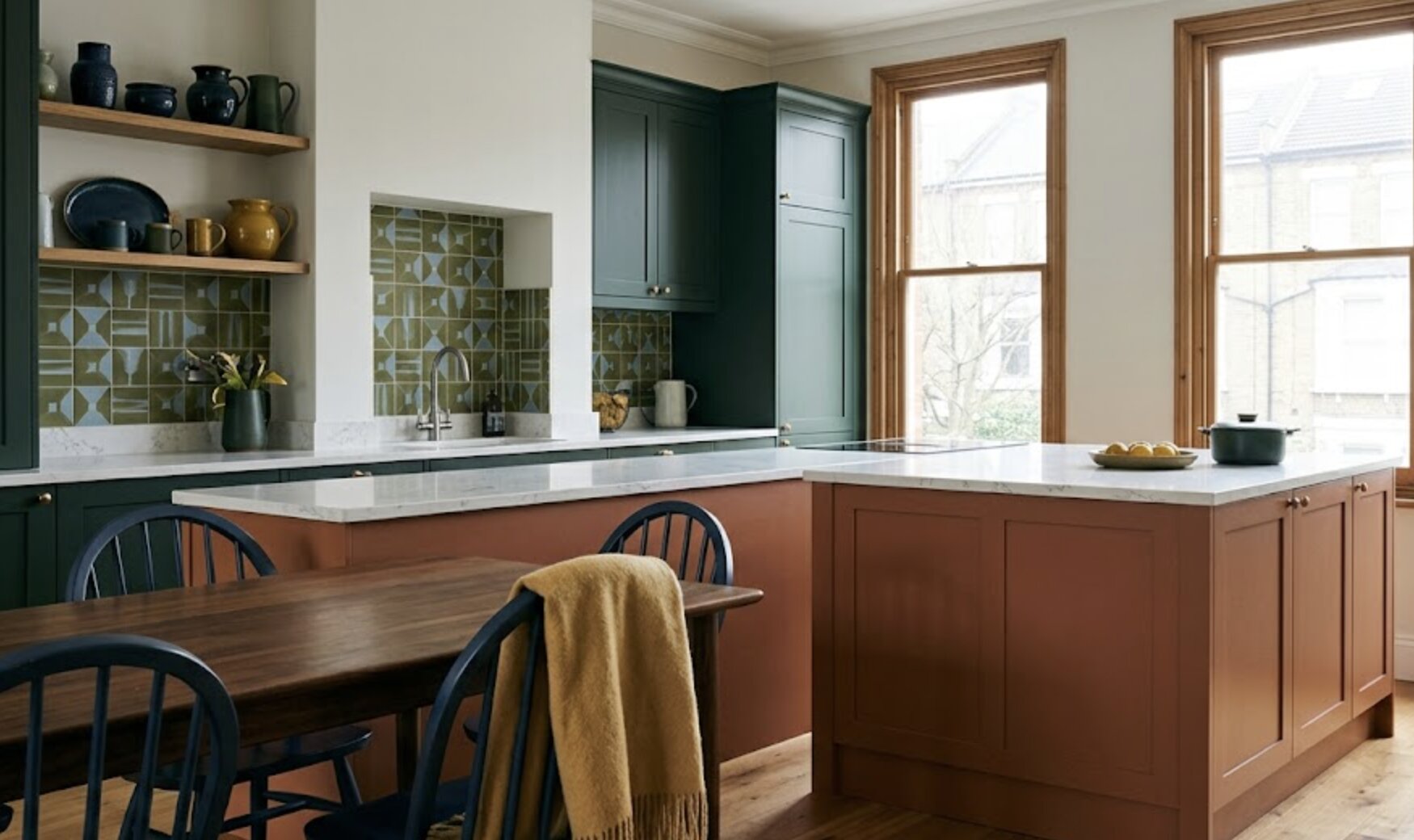
Contrast colors are hues positioned opposite or apart on the colour wheel that create visual tension, depth and focus within a room. In interior design, they’re used to highlight architectural features, define zones and lift an otherwise neutral scheme without overpowering it. Get the balance wrong, though, and a bold accent wall can tip a calm room straight into visual chaos. In this guide, we’ll cover the seven classic colour contrasts, how to layer colour into a neutral base and which pairings genuinely work together in a lived-in home.
I’ll share the measurements, thresholds and mistakes I’ve picked up over years of colour consulting, so you can bring in contrast with confidence rather than guesswork. Neutral interiors are enduring and classic. However, if an exacting technique is used to incorporate contrasting hues, an ordinary home can be transformed into a visually interesting and unforgettable interior. When used judiciously and strategically, colours can be used to add character, accent, and highlight architectural elements without losing elegance.
The secret is to use contrasting colours in a strategic manner and not oversaturate the space with multiple colours competing for attention. Today’s interior design goes hand in hand with creative colour palettes and combinations that can be energetic and vibrant yet have a soothing base tone, making the space feel harmonious and lively. Tasteful contrasting colours are often recommended by professionals in Oakland property management, as they can create a more appealing interior, attract a larger pool of potential tenants, and boost the property’s overall value. When used with a plan, contrast may be a wonderful design instrument to make use of in each room, and keep the entire look in check.
The seven colour contrasts consist of hue, light-dark, cold-warm, complementary, simultaneous, saturation and extension relationships between colours on a wheel. Interior designers combine hue, tone and saturation contrasts to build depth, mood and focal points within one room.
This framework was popularised by the Swiss artist and theorist Johannes Itten, and it’s still taught in colour courses today because it works. Hue contrast is the boldest of the seven, pairing pure primary colours like red and blue with no tonal softening at all, which is why it suits a single statement piece rather than a whole wall. Light-dark contrast is gentler on the eye and does most of the heavy lifting in period homes, where a pale ceiling against a deep skirting board adds architectural definition without a drop of extra paint on the main walls.
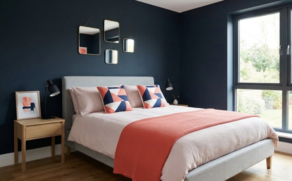
Cold-warm and complementary contrast are the two I reach for most often with clients. Cold-warm pairs an orange-leaning terracotta against a blue-leaning sage, giving a room warmth and calm in the same breath, while complementary contrast (opposite hues on the wheel, such as navy and burnt orange) delivers the punchiest, most Instagram-friendly result. Saturation contrast, placing a vivid mustard cushion against a muted grey sofa, and extension contrast, which governs the proportion of each colour rather than the colour itself, tend to work best as finishing touches once the bigger decisions are already made.
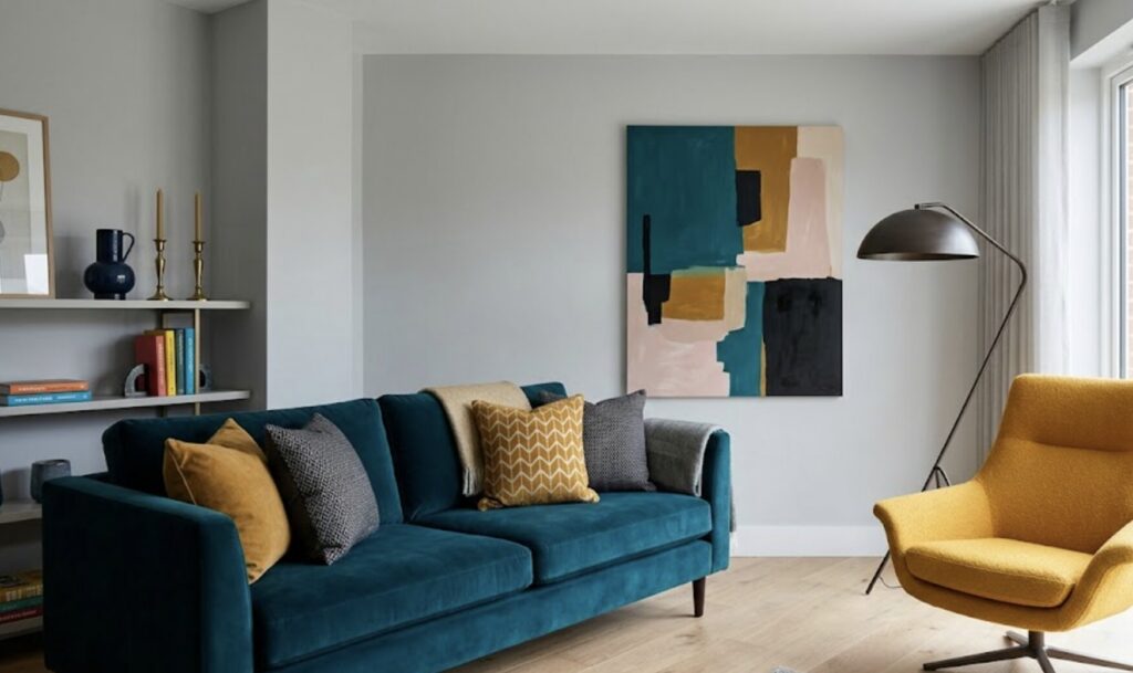
Using contrast colors safely in a neutral home means limiting bold shades to 10 to 15 percent of wall or floor surface while keeping neutral tones dominant. Ventilation and low VOC paint also protect indoor air quality during application.
This checklist lists the steps for introducing contrast colours into a neutral home safely.
Air quality genuinely matters here too, particularly in smaller or older properties. The US Environmental Protection Agency notes that VOC levels indoors can run considerably higher than outdoors during and after painting, which is exactly why steps six and nine on that list aren’t optional extras.
Navy blue and terracotta, forest green and blush pink, and charcoal grey and mustard yellow contrast well together in most home interiors. Each pairing works because the hues sit roughly 90 to 150 degrees apart on a standard colour wheel.
Navy and terracotta is the pairing I get asked about most, and it earns its popularity honestly. The navy grounds a room while the terracotta warms it up, and because both colours have a similar depth of tone, neither one shouts louder than the other.
Forest green and blush pink is softer and works beautifully in bedrooms or reading nooks, rather like pairing a walk in the woods with the inside of a seashell. Charcoal grey and mustard yellow, meanwhile, is the pairing for anyone who wants drama without going full primary colour, and it photographs particularly well against pale oak or ash furniture.
| Contrast Type | Example Pairing | Best Suited Room | Recommended Accent Proportion |
|---|---|---|---|
| Complementary | Navy blue & burnt orange | Living rooms, dining rooms | 10-15% of wall space |
| Warm-cool | Terracotta & sage green | Kitchens, snugs | 15-20% of wall space |
| Light-dark | Charcoal grey & cream | Hallways, small bathrooms | 20-30% of wall space |
| Saturation | Mustard yellow & soft grey | Home offices, reading nooks | Under 10% of wall space |
The table shows that the bolder the contrast, the smaller the proportion of the room it should occupy, and that hallways and small bathrooms can absorb a higher percentage of dark tone than a main living space.
Contrast colour, handled with a plan, is one of the most rewarding tools available to anyone decorating a neutral home. It doesn’t require gutting a room or committing to a permanent, all-over scheme.
A single wall, a considered cushion arrangement or one beautifully painted door can shift a space from safe to memorable, and the seven classic contrasts, the 60-30-10 rule and a sensible testing process will keep that shift looking deliberate rather than accidental. Start small, test properly, and let the neutral base do what it does best: hold the room steady while your chosen accent gets to shine.
Key takeaways:
What are the 7 color contrasts? The seven colour contrasts are hue, light-dark, cold-warm, complementary, simultaneous, saturation and extension, a framework rooted in classic colour theory. Each one describes a different way two colours can interact on the wheel, from bold primary pairings to subtle tonal shifts.
How do you add color in a neutral home? Start with one accent wall, door or piece of furniture rather than repainting an entire room. Cushions, artwork and rugs are the lowest-risk way to test a contrast colour before making it permanent.
What colors contrast well together? Navy and terracotta, forest green and blush pink, and charcoal grey and mustard yellow are reliable, well-tested pairings. Each works because the two hues sit at a meaningful distance apart on the colour wheel rather than sitting too close together.
What is the color rule for interior decorating? The 60-30-10 rule splits a room into 60 percent dominant neutral, 30 percent secondary tone and 10 percent bold accent colour. It’s a simple ratio that keeps contrast colours feeling intentional rather than overwhelming.
How much contrast color is too much in a room? Once a bold accent colour covers more than roughly 15 to 20 percent of a room’s surfaces, it tends to dominate rather than accent. Keeping contrast colour contained to feature walls, doors or soft furnishings avoids this tipping point.
Can you mix warm and cool contrast colors in the same room? Yes, warm and cool contrast colours can sit together very successfully, such as terracotta against sage green. The key is choosing one to dominate and letting the other play a supporting role rather than giving both equal weight.
Are low VOC paints necessary for contrast color walls? Low VOC paints aren’t legally required for most domestic repainting, but they’re strongly recommended, particularly in bedrooms, nurseries and smaller rooms. Courses such as UC Berkeley Extension’s Colour Theory and Application programme cover both the aesthetic and practical sides of professional paint selection.
What is the difference between contrast and complementary colors? Contrast is the broader term covering any pairing that creates visual tension, including light-dark or warm-cool combinations. Complementary colours are a specific type of contrast, sitting directly opposite each other on the colour wheel.